How To
Travertine
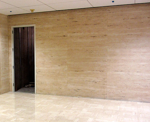
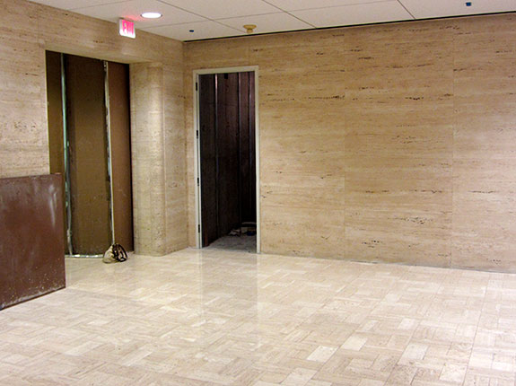
Recently, I received a phone call from an interior designer that works for an architectural firm that I’ve worked with off and on for years. She wanted to know if I could paint faux Travertine to match existing Travertine in a large office building in my hometown of Cincinnati, Ohio. I said I thought I could, but I would like to look at it first to make sure of what they expected. I met with the interior designer and the project manager to review what they were interested in. Little did they know I had never really painted Travertine except on sample boards and on a few, very small projects. They wanted me to paint a temporary wall to match the existing Travertine as close as possible, matching the color, movement, scale and size of the blocks. Well, my project just got harder. Of course I tell them “I can do that” with absolute confidence in my voice. They asked for a bid and also requested a sample of what I could do before they would give the final approval, and then they left. I stared at the Travertine and stood so close to it that people viewing me must have thought either that I was blind and lost in the corner or just crazy. Studying the Travertine, I thought about how on Earth was I going to paint this, and how long would it take to do 300 square feet of it. Of course, I guessed at the answer, because, remember, I never did this before! I gave them my educated guess of how long it would take and what it will cost them. They approved moving onto the design phase, for which I told them the two samples would cost a total of $200.00 if the job did not go through. (I figured I might as well try and make something for my time if they choose not to do it.) They approved my making two samples, one a basic simple version, which had a lower cost associated with it, and a more detailed match with a higher-related cost.
In this step by step, you will learn the more complex sample. The pictures all were taken on the jobsite while I was doing the project.
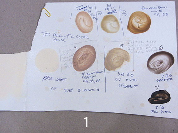
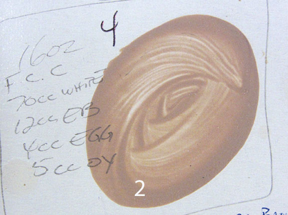
The first picture (photo 1) is a record of the steps done while making the two samples. I went down to the jobsite with my paints, tools and bag of tricks that I imagined might work to make my sample. This way, it’s much easier to get as close as I could to the color, movement and scale of the existing Travertine. I make a job legend like this for every sample I make. As you can see, it shows a custom base color and seven different glazes, spatter and accent colors used in the final treatment. While making the sample, I have no true idea if the colors will match the final result or not. This is where experience helps, and being able to have the vision to see through the layers and “guess” what each color is and how the progressive additional colors will change each layer to finally end up close to what I want. When first making up the sample, I wrote down that I used FauxCrème® Clear as my glazing medium, and I used abbreviations for each FauxCrème Color™ put into every mix. I kept a sealable container for each color and put each color onto a piece of cardboard for a dried down sample. Keeping the colors wet in a container helps me color match for the job. This way, I have both a wet and dried version of the color. The close up picture (photo 2) shows what I do when making the color for the job, a precise formula for easily remaking the colors if later on needed. This formula is 16 oz. of FauxCrème® Clear to 70 cc or milliliters of White FauxCrème Color™, 12 cc of Earth Brown, 4 cc of Eggplant and 5 cc of Ochre Yellow. Now, how did I come up with that formula? I knew my color looked like it would use Earth Brown and White for sure, and after mixing those together, I realized it was not yellow enough, so I added Ochre Yellow. But, this made it too yellow, so I added Eggplant to knock back and neutralize the yellow. These little baby steps are all needed to finally end up with the correct value, hue, and intensity of color required. I did this same system with every color I made.
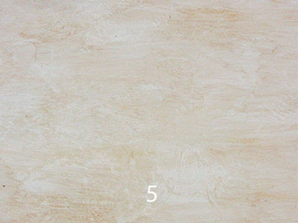
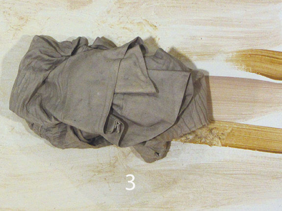
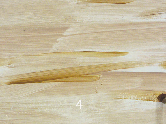
The first thing I had to guess was the base color. This was fairly simple because the overall color of the Travertine was a dirty Off White, so I made a custom match base coat in the correct hue of Off White. From there I mixed up three colors with FauxCrème® Clear that I knew I wanted to use as the farthest back broken color effect found in the Travertine, labeling these colors number 1, 2 and 3. I applied them on the sample with a small brush but I used a 3” brush on the wall, using mostly numbers 1 and 2 for the overall tonality with a touch of number 3 to warm up the surface (photo 3). I applied these colors working in a 5 foot long by 3 foot area. Then, taking a damp rag, I blended them together and pushed them out as far as I could. My working area now became about 7 feet long by 4 feet high (photo 4). All ofmy brush and ragging movements were done horizontally to set up the underlining movement of the Travertine (photo 5). Once the entire wall was completed, I called it a day and let it dry overnight.
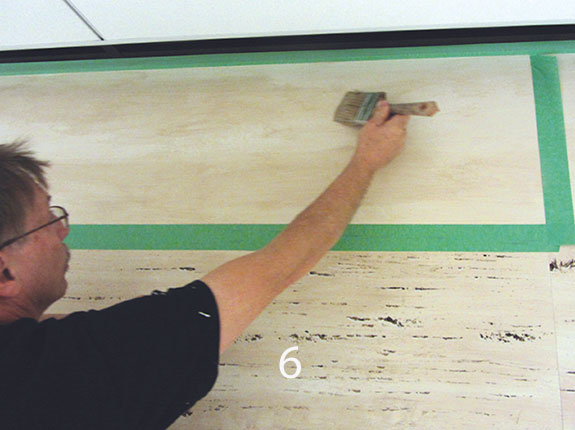
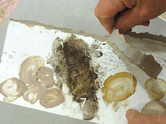
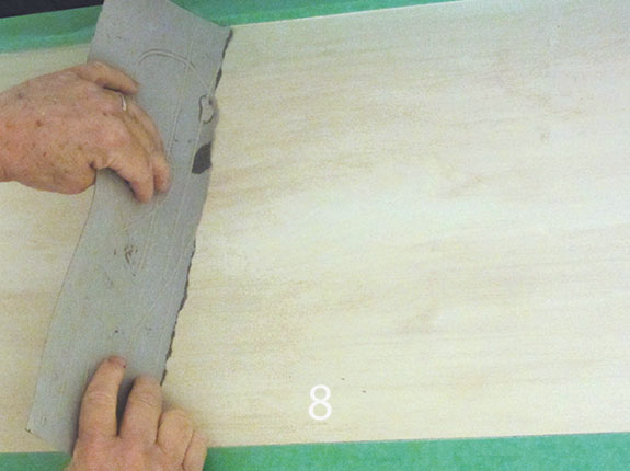
The next morning, I used a laser level and penciled in grout lines to mimic the exact size and spacing of the real Travertine blocks. After this was done, I taped out every other block to work on. Each entire block was painted completely one at a time with all phases in this next sequence of steps. I ended up being able to do five blocks in an hour, and Teresa painted in the highlights following right behind me. The first paint step inside the block was to use colors 4 and 5 and apply them once again a horizontal movement, being careful to create irregularity in their composition and leaving some of the textured background done the day before exposed with no glaze on it (photo 6). Next I took some cardboard and tore it with as straight of an edge as I could. As you can see this was the piece I usedwhile color matching my large batch of paint to my sample batch (photo 7). Taking that torn cardboard edge, I held it at a 70 degree angle to the wall and pulled it horizontally through the wet glaze, pulling it evenly, straight, and with only a little random motion up and down to the cardboard (photo 8).
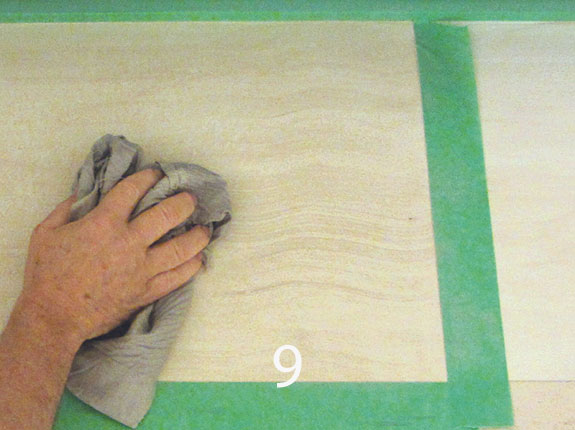
While still wet, I took a damp rag again and fractured some of the horizontal lines created with the cardboard. This rag also was used to wipe out glaze in areas, if any change in composition was needed (photo 9).
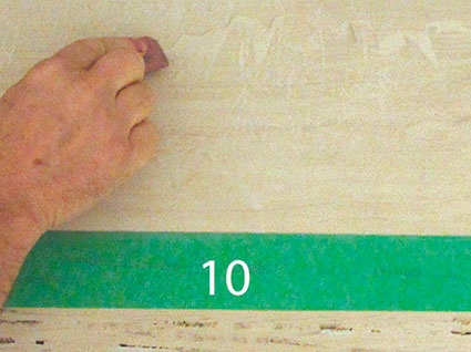
Next I used a pink pearl eraser and dragged it horizontally here and there, twisting and turning it to create some of the bigger movement seen in Travertine (photo 10). Now, using a badger brush, I softened back any areas that were too pronounced.
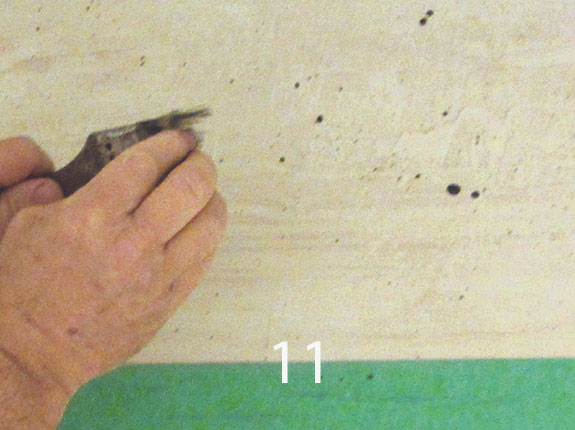
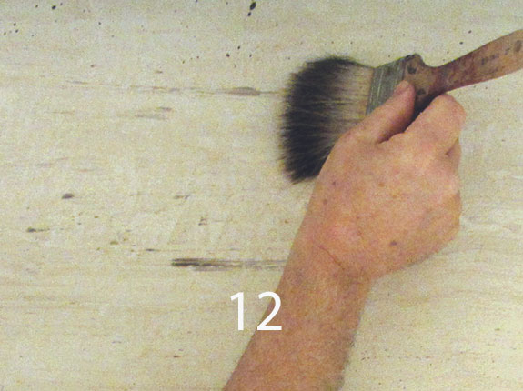
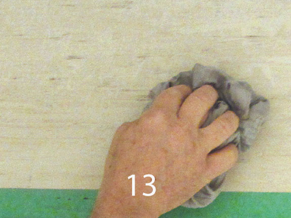
Next I took my spatter color 6, which was FauxCrème® Clear mixed with Van Dyke Brown FauxCrème Color™. Using a 2” chip brush, I spattered this liberally onto the surface (photo 11). I then brushed these spatters out with a badger brush with a firm long horizontal stroke (photo 12). These spatters became some of the pitted background texture seen in Travertine. Every now and then some of the spatters were too big or too dark, so I took my damp rag and blotted them to recess them more into the background (photo 13).
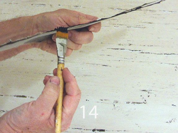
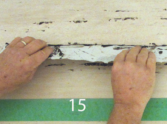
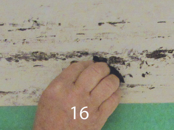
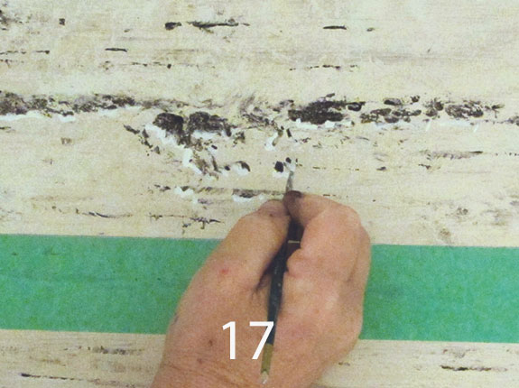
Using a different piece of cardboard, I once again tore an edge as straight as I could. I then painted one edge of the cardboard with straight Dark Brown FauxCrème Color™ (photo 14). Then, tapping it onto the surface in a random irregular horizontal line, I created an interesting composition which mimicked the darker pitted movement in the real Travertine (photo 15). At this point, I used an old, torn up, ragged natural sea sponge to apply some of the Dark Brown color. With a jagged piece of the sponge, I created the larger organic pitting found in Travertine (photo 16). The next step, which was also the most time consuming, was to use color 5 mixed with a lot of White FauxCrème Color™as a highlight color. This was painted underneath everywhere that the Dark Brown color had touched. This helped to create a three dimensional look for the pitting and made a very big difference in the reality of the overall look (photo 17). The last step was to use color 5 once again, but this time inside of a Buegler stripping tool to paint the grout lines onto the wall.
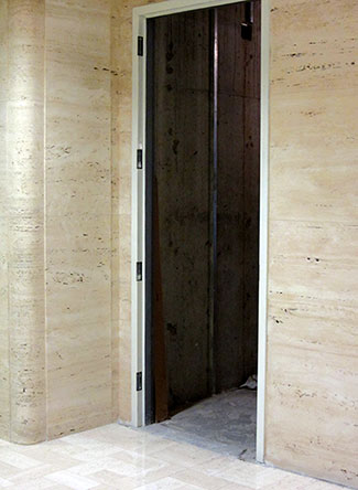
Overall, the project turned out great, and the clients like it so much that they now are considering to make what was to be a temporary wall a permanent wall (photo 19). The wall on the left is the original, real wall, and the wall on the right is our work.

Finish Courtesy of: Gary Lord
Prismatic Painting Studios
Cincinnati, OH
If you enjoyed this article, send
it to your friends on Facebook!

