
“Beyond the Roses”
My fingers were crossed, wishing and hoping not to walk into another request for the “vanilla” treatment, so commonplace in upscale 55+ communities in Fairfield County, Connecticut. “Keep it simple, not too much color, beige on beige and remember resale is a big consideration” is all I ever heard. This time, my wish was rewarded. The unit was owned by an elegant woman who loves color, bling, texture and exciting design. Elated, I thought, “Working here is going to be fun!”
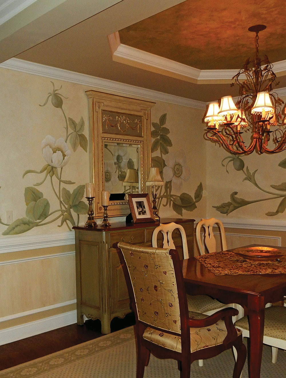
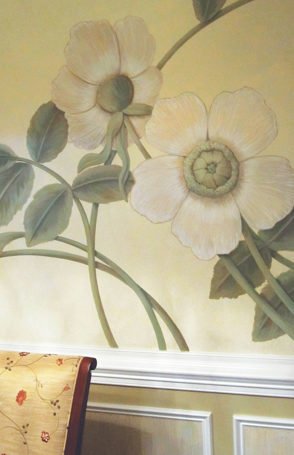
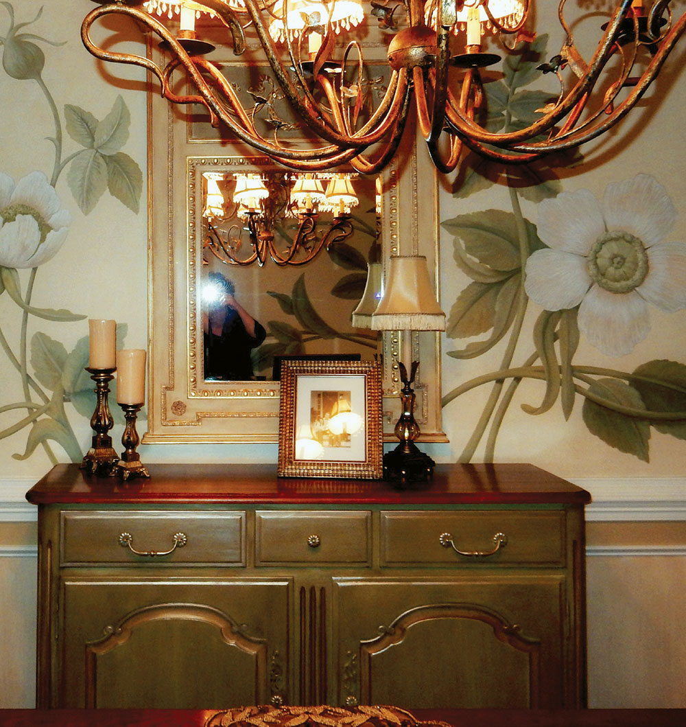
Take a walk with me, starting in my favorite room, the dining room. The owner had already “done” this room, and though it was OK, it was only just that…OK. The sage and tan paisley wallpaper did little to showcase her personality. We discussed the idea of a floral composition and using really large scale blossoms, so I headed in that direction, researching various flowers. I came across an antique rose called “Rosa deCandolle,” seeing instantly that it would be perfect for the space. Surely the universe was backing this project when my client, known as “Jeannie,” shared with me with a smile—that Jeannie was short for her given name,Genarosa.
The walls were base coated in Neutral White SetCoat® and then glazed with Fontana Gold MetalGlow®. Painted in artists’ acrylics, the roses and the whimsical stems and leaves literally glisten on the color. Using the palette established by the mural, the tray ceiling and flanking half columns were given a subtle texture with LusterStone®, one of my favorite choices for ceilings up lit by chandeliers. A little attention was need for the framed panels below the chair rail—a straie with thinned down LusterStone® gives them a subtle and shimmering finish.
The heavy wood of the sideboard now felt oppressive. After prepping the piece, the sides and front of the cabinet were base coated in Celery MetalGlow®. With a soft wash of color using Dark Brown FauxCreme Color™, it now sparkles with accents of rubbed Fontana Gold MetalGlow®.
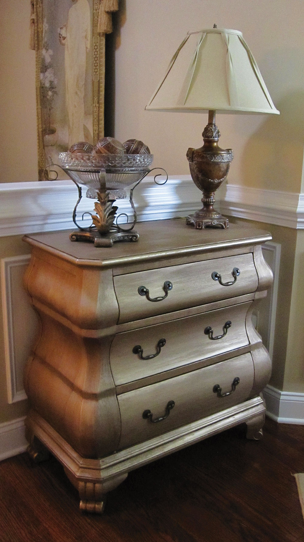
The success of this piece of furniture dictated several makeovers. The wide array of Faux Effects® products make choices virtually limitless! A stodgy Bombay chest breathes a new contemporary life with a striae of PlasterTex™ over the entire surface for a very slight bit of texture, followed by a coat of Silver Lining MetalGlow® for a modern look. A soft application of diluted Van Dyke Brown Stain & Seal™ brought all of its new characteristics to life.

Down the hall, thinned-down LusterStone® was applied to the frame on a mirrored cabinet. Its top was refinished with a multi-layered textured treatment of LusterStone®, which continued the color theme from the dining room using Brown Suede, Green Onyx, Medallion Gold and Antique Parchment. Another cabinet with a matching mirror received a new look as well with Ancient Gray LusterStone® (I swear, I keep finding different ways to use this amazing stuff!) applied in an irregular knock down fashion. A color wash of diluted coats of LusterStone® in Brown Suede, Black Diamond and Espresso Chocolate, followed by a rubbing of Rich Brown Stain & Seal™, brings the finish together. Dibs and dabs of LusterStone® and Stain & Seal™ marries the mirror to the cabinet.
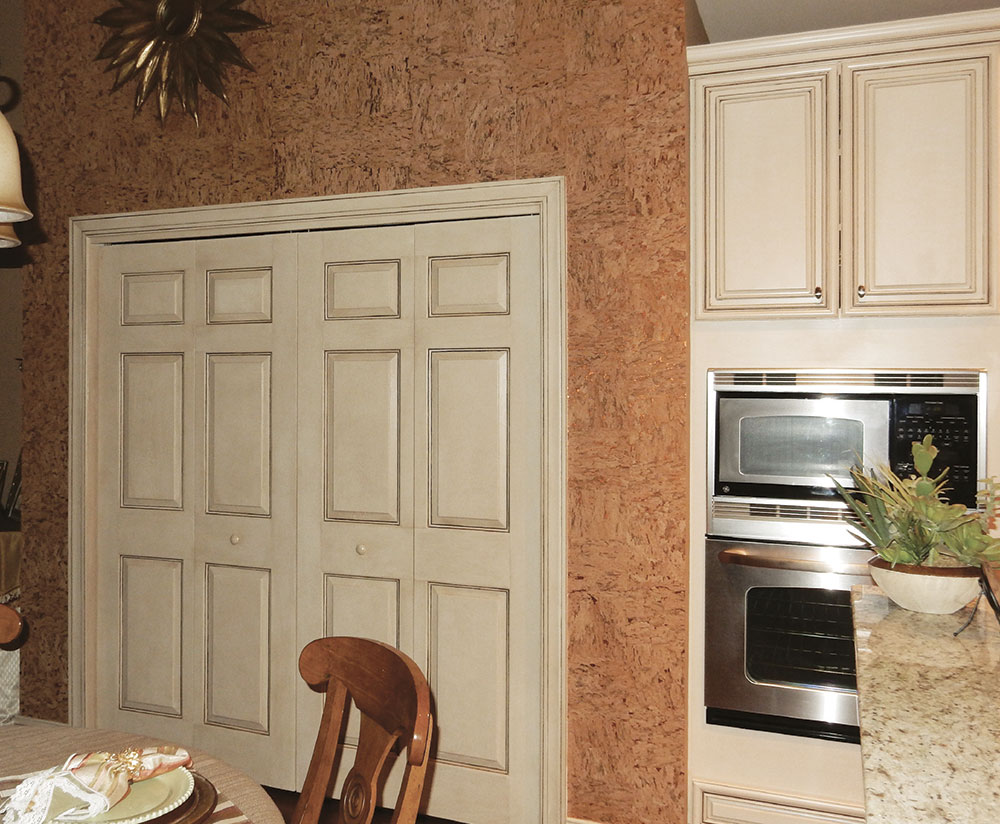
A simple solution was called for in the open kitchen. While the cabinets were lovely with a deep cream-toned base with umber glaze, two large doors to the pantry were left with nothing more than a coat of builder’s white paint. This eyesore was easily remedied by matching the pantry doors to the palette of the cabinets, looking as though they were part of the original install. Once painted, the doors were glazed with a matching umber tone using FauxCreme® Clear with Dark Brown, Van Dyke Brown and Black FauxCreme Color™. Once dry, the finish was sealed with AquaGard™ and then AquaThane™ (both in satin sheens) for added protection. I can’t take the credit, but don’t you love the cork wallpaper on the walls surrounding the pantry? Nothing but success comes when an artist has the opportunity to work with a client whose taste has such superb sensibilities. A thousand thank yous, Jeannie!
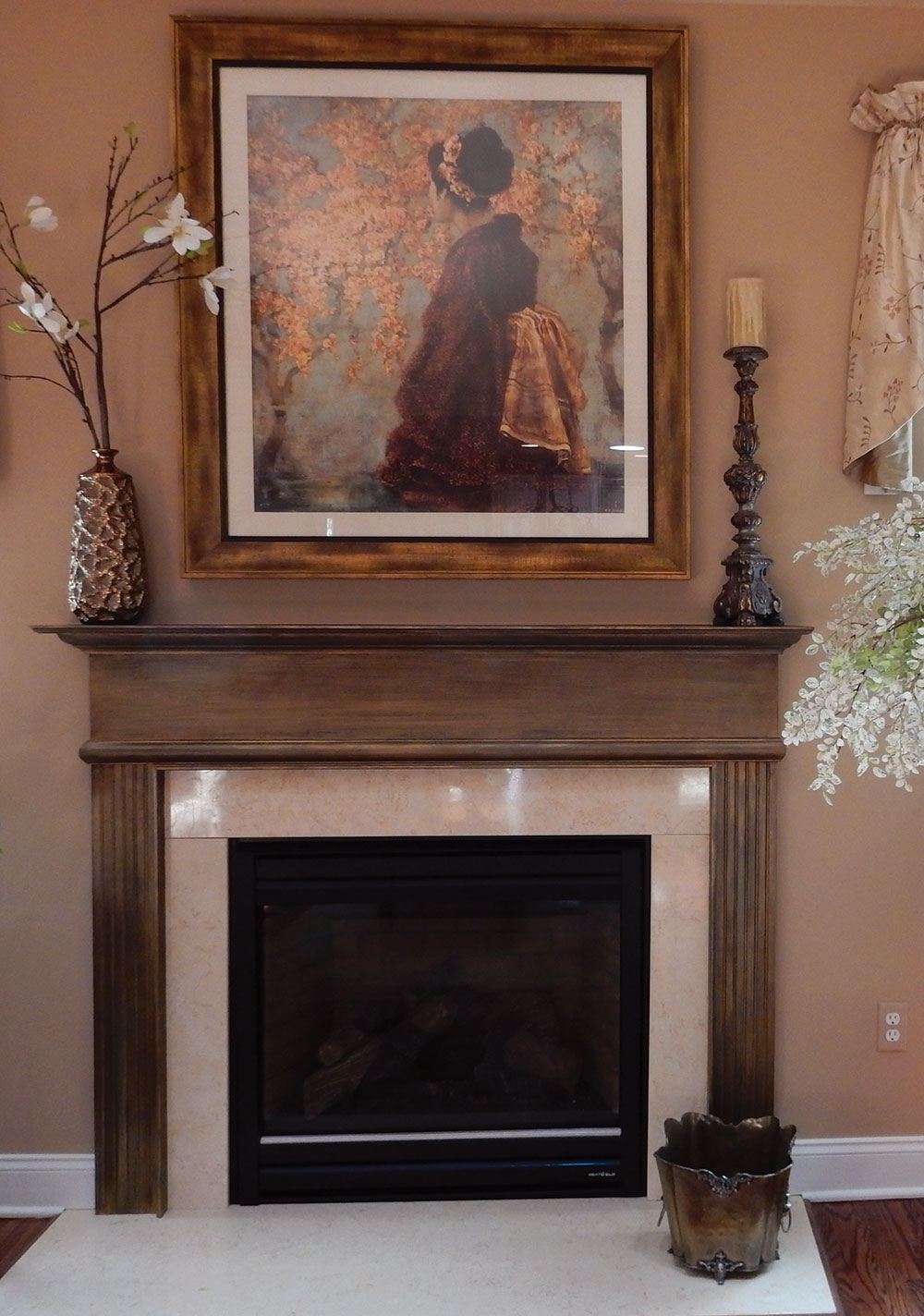
That same bucket of builder’s white paint left the fireplace in the living room looking quite needy. A painting above the fireplace provided my palette. Light turquoise in the artwork pointed to a basecoat of a strong teal. Next, it was striaed with FauxMetal™, first in Copper and then with Bronze.When dry, a FauxCreme® glaze tinted with Dark Brown and Van Dyke Brown FauxColor™ was applied using a flogging technique. Lastly, a coat of AquaGard™ and then C-500™ provides durable protection.
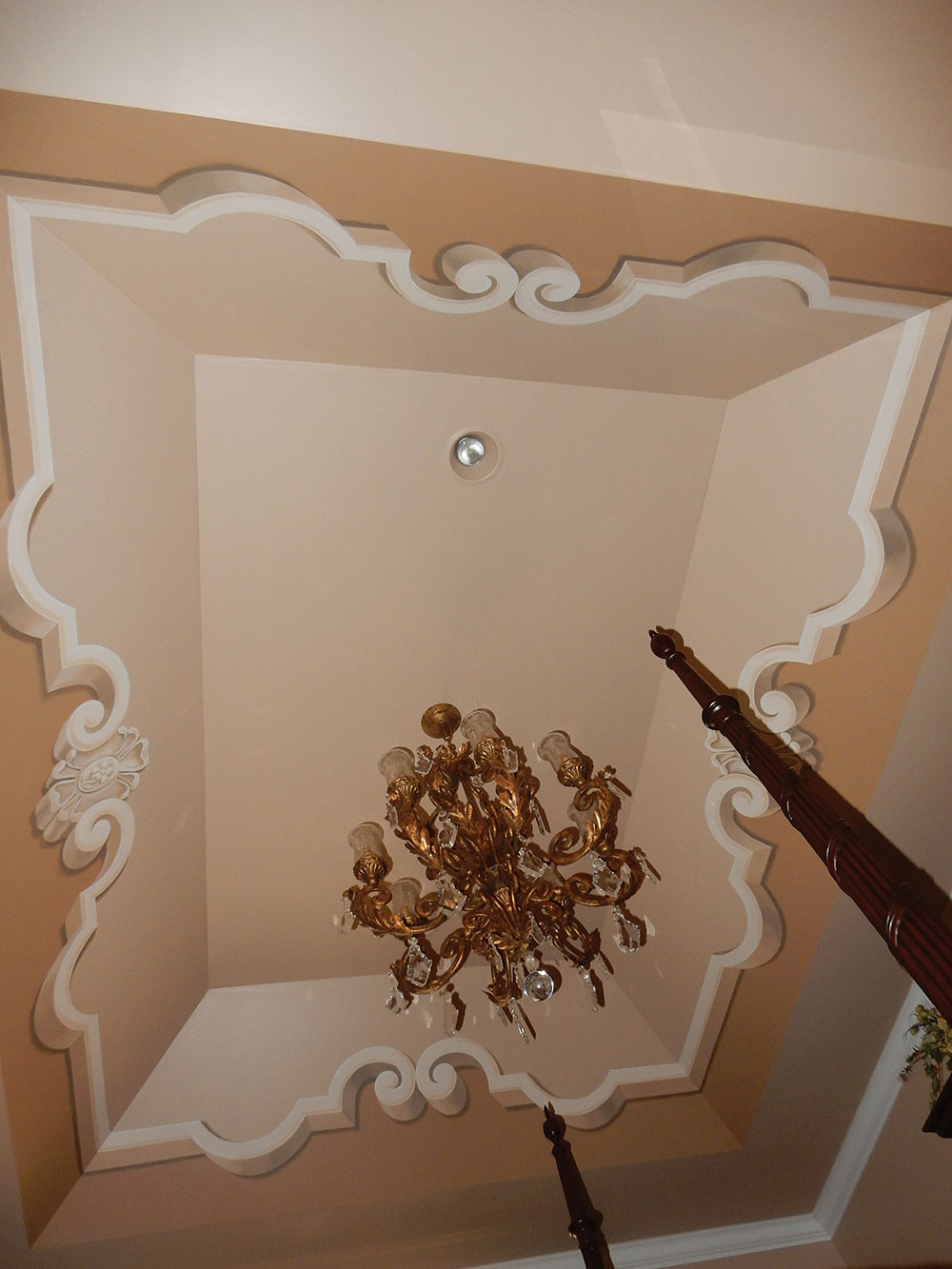
The final area to be addressed was the yawning cavern of the tray ceiling in the master bedroom. I have found using Faux Effects’® FauxCreme Color™ makes painting monochromatic ornaments a breeze. The tray was painted in a soft beige and a full-bodied tan color for the bottom of the design. The colors for shadowing and highlights were easy, and more importantly consistent, using White, Dark Brown, Autumn Brown and Van Dyke Brown FauxCreme Color™. The trompe l’oeil is very effective and adds missing architectural detail that makes the ceiling pop.
I was fortunate to be commissioned for this wonderful project. Armed with a limitless bucket of Faux Effects® products and no cap on exploring options, as an artist I know it doesn’t get better than this.

DECORATIVE ART BY: LEICHSENRING STUDIOS
PHOTOGRAPHY PROVIDED BY: SHARON LEICHSENRING
WRITTEN BY: SHARON LEICHSENRING
If you enjoyed this article, send
it to your friends on Facebook!